
Here are some helpful tips and guidelines from Blumlein Associates, Inc. (http://www.baidesign.com/), an Exhibition and Graphic Design studio on Long Island, to consider using when creating interpretive graphics and wayfinding signage.
- Determine the communication objectives. It is important to identify the audience, research the subject matter (including keeping track of giving credits where they are due), and creating a narrative (style/tone for the storytelling).
- Create a hierarchy of information to be conveyed based on its importance. Organization is key.
> Level A information = Headers/Titles – Most important facts – define subject matter. Designers use a bolder or more unique font size, style and color make this information stand out from the rest.
> Level B information = Sub-headers/Subtitles – Secondary information that complements and expands upon the Level A information.
> Level C information = Complementary, descriptive copy – short paragraphs with more detailed information, explaining and expanding the level of information provided in Levels A and B. Captions are included here, and typically are the smallest font in the graphic.
- Headers and Sub-headers are critical and should be concise and words chosen carefully. These identify subject matter and themes/concepts to be further described in the body of the graphics. They can be written in such a way that they deliver information that don't necessarily require a viewer to read beyond them.
- You may have heard this before, but often with interpretive graphics this is a good rule of thumb... Less is More. Editing is critical, as you want to make sure that even if you only have someone's attention for a glance, they will see something that either will capture their attention or, better yet, stick with them. A major goal would be to have someone walk away from the graphic having learned something. You may only have 30 seconds to a minute of someone's attention, so make it count. It's always good to keep things SIMPLE.
- Consistency is important, and a format should be developed and followed when creating multiple signs or graphics. Colors, materials, fonts are all things that should carry over from one to another. The development of an icon may also be helpful, as the graphic and signage 'system' will become easily identifiable by passers by.
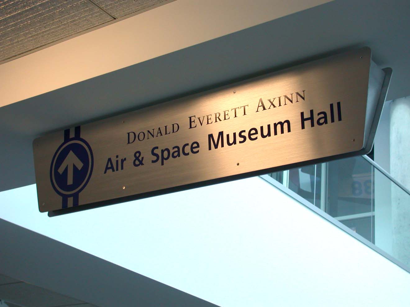
- For Wayfinding Signage, it's important to have clear, legible type that's easy to read from a distance.
 Wayfinding signs from Cradle of Aviation Museum, Garden City, NY
- Regarding interpretive graphics, it's a good idea to use color and images effectively. The most interesting panels should aim to include any combination of photos/images, illustrations/maps, and text. This way there's something for everyone.
> Text should be prepared in easily digestible blocks. If possible, no more than a sentence or two or a few bullet points.
> Images should be as interesting and engaging as possible, and should tell a story even without relying on captions.
> Maps should be simplified so they are easy to read. Color-coding and use of icons can help dramatically.


Interpretive sign samples from Sandminers Monument in Port Washington
- Whenever possible, try to present the information so that it is relatable to the viewer. If someone can make a personal connection to the information, they will be more likely to remember it. This isn't always easy to accomplish depending on the subject matter.
- Generalize the information being presented to accommodate a wide variety of ages and intellectual levels so that anyone can comprehend the story line. If you have the means to create a website or printed materials to achieve a deeper level of information to those who are interested, then take advantage of those opportunities.
- Take an editorial approach to copywriting - and proof-read and have multiple team members review the content to make sure that it is well versed.
Here are some DON'Ts (things to avoid):
- Don't try to put too much information into a panel. If it seems overwhelming, it probably is. The last thing you want is for someone to look at it and, without more than a glance, decide it's too much of a burden to involve themselves in it.
- Don't mix too many fonts or visual styles as this will end up chaotic and disorganized.
No comments:
Post a Comment